Taipei on the Go!
Overview
This is a 4-month project from the Human-Computer Interaction class in which students were separated into groups to design a web/mobile app together utilizing the knowledge from Don Norman's book The Design of Everyday Things and the knowledge from psychology such as visual perception, attention, memory, metal workload, emotion, etc. Our team worked on designing an app to make it easier for people who are not familiar with Taipei to use the public transportation system.
In this project, we first analyzed the activity of using the public transportation in Taipei with the Activity/Task/Action level structure and the Seven Stages of Action, and then conducted user research to further understand the issue. Before kicking off the design, we performed task analysis and card sorting with users to understand the use cases as well as the information ecosystem and structure of this app. Next, we defined the brand identity and visual style of this app, and created a mid-/high- fiedility prototype for the user testing and iterated our design.
Timeline
Oct 2018 - Jan 2019 (4 months)
Role
Research
Interaction Design
Visual Design
User Testing
Team
游智凱
鄭心茹
林岳柔
Methods & Tools
Research (Interviews/Card Sorting)
Task Analysis
Information Architecture
Prototyping
User Testing
Sketch app
Background
We started working on this project by thinking about the system image of our product and analyzing the the activity of using the public transportation in Taipei with the Activity/Task/Action level structure and the Seven Stages of Action from The Design of Everyday Things, to gain a preliminary understanding of the issue.
What system image and expectations might our users hold?
Since our product is an app to help people use the public transportation in Taipei, we assumed that our users would expect our app to provide the feature of planning directions such as what kind of transportation to take and how to transfer from one kind of transportation to another. They might also expect that our app provide the information about the transportation time, costs, and other details about stations and transfers.
The Activity/Task/Action Analysis
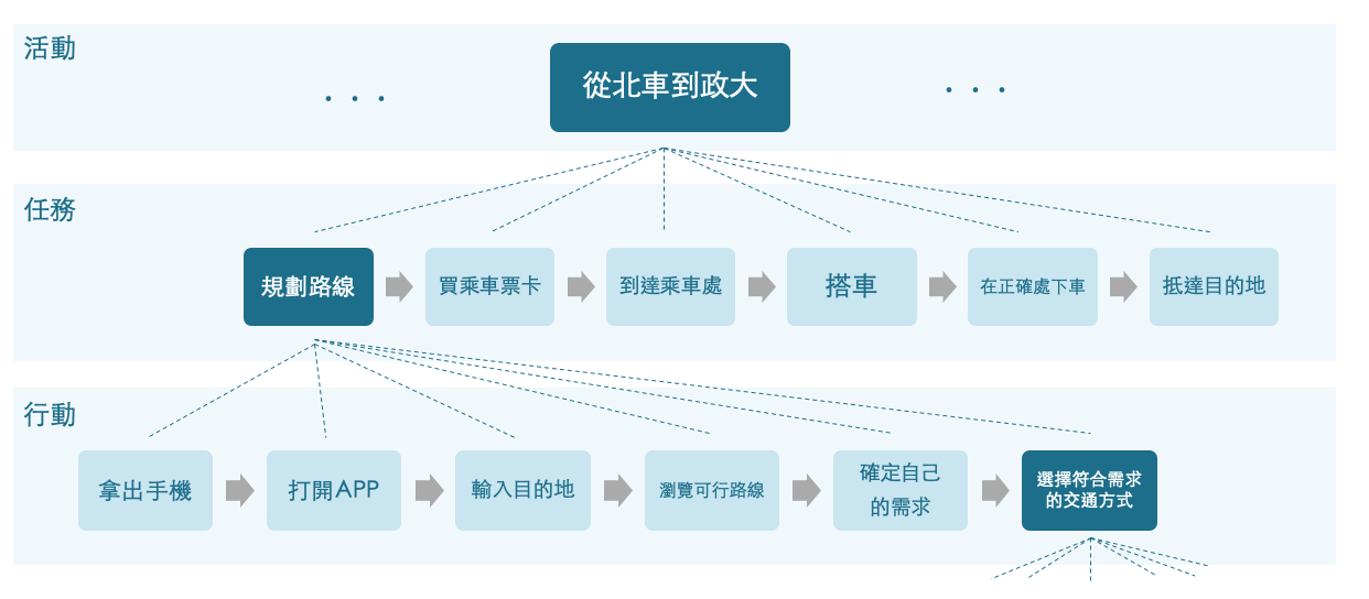
We analyzed the activity of moving from Taipei Main Station to the university, which would go through the tasks of planning the directions, buying tickets, getting to the station, getting on the public transportation, getting off at the right stop, and arriving at the destination.
Under the task "Planning the directions", the users have to further go through the actions of taking out their mobile devices, openning the app, inputting the destination, checking out possible routes, and matching the route that fits their needs.
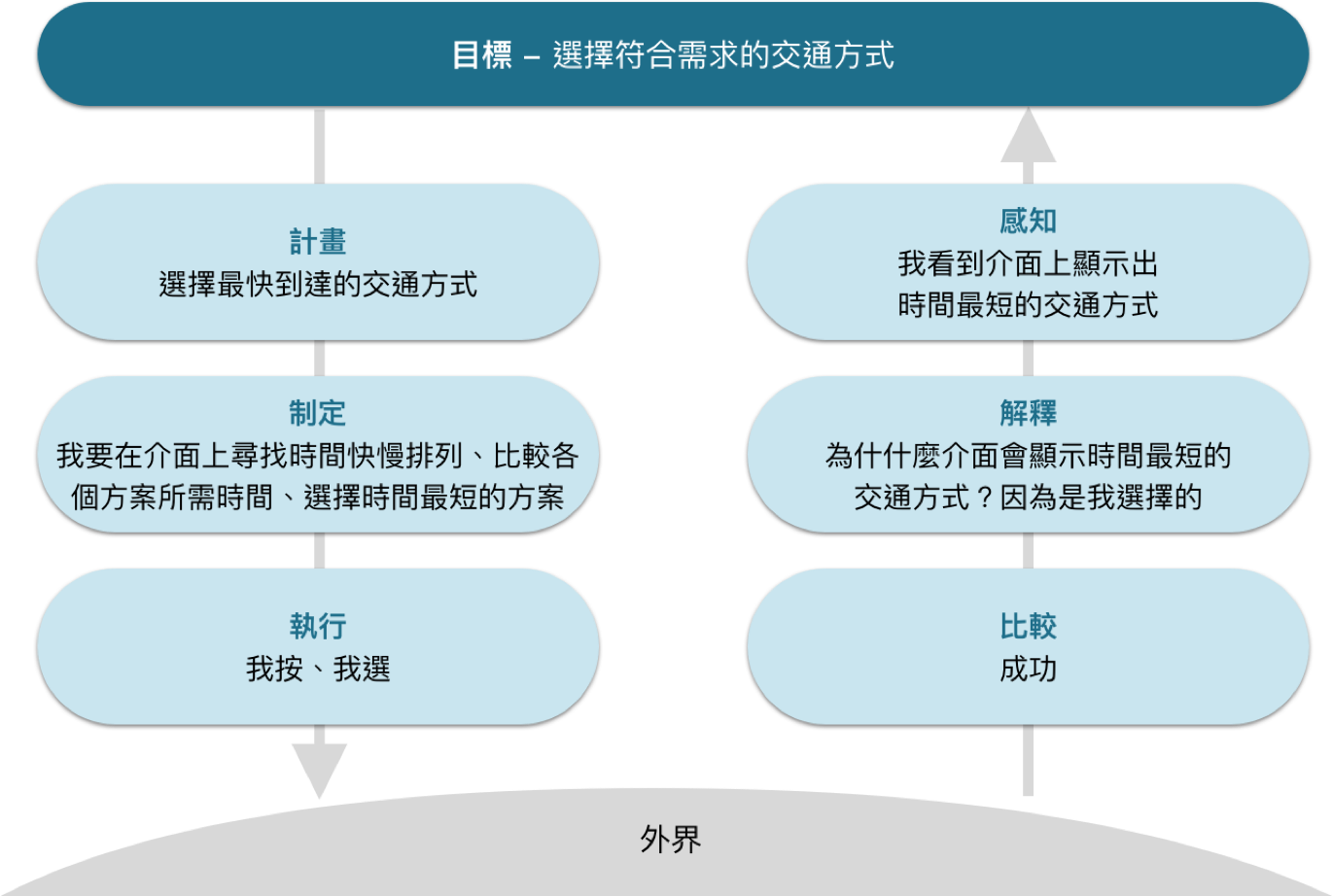
The Seven Stages of Action
We then further analyzed the action "matching the route that fits their needs" with the seven stages of action to picture how the human mind would work in order to match the route that fits their needs, and to think about how can we help them through interaction design.
Research
After having the preliminary background of the issue, we conducted 4 interviews with our target audience who are not from Taipei and hadn't stayed in Taipei for over a year to gain a further understanding.
Key Findings
When Planning
It is hard for the users to quickly find the plans that fits their needs: because it is difficult to tell that a certain plan fits what kinds of needs and how many of them. For instance, if the users wants to find a plan that is the fastest and also not too expensive, it is hard for them to tell which one is the fastest, which one is the cheapest, and which one is the fastest but a little more expensive.
When Transfering
It is hard for the users to tell which bus stop is the one they are looking for to wait for the bus they want to take: because the icons of all bus stops are the same no matter they are on different sides of the road or not or they are targeted or not.
It is hard for the users to tell the direction that the location indicator is pointing at: currently on Google Maps the location indicatore is a gradient sector.
When Riding
They users have no idea when should they get off, so they often miss the stop: because sometimes there are some problems with the scrolling LED marquee, so the users have no idea where exactly they are. Or even when the LED marquee works, the users still don't know at what point should they ring the bell.
Insights and Ideas
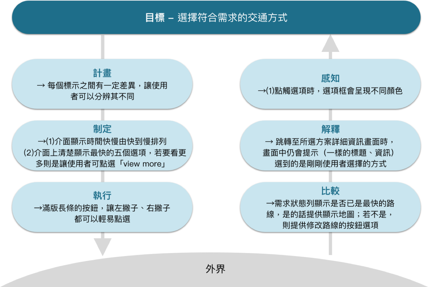
How might we help the users to tell if the direction plans meet their needs or not?
By showing users what specific features a certain direction plan has, for instance, one plan might be the fastest plan among all, another plan might be the cheapest, and still another plan might include fewer transfers, etc. Also, users can set their preference for sorting results (clarifying and matching their needs) in advance in the setting.
How might we help the users to distinguish the bus stop they want to go from others?
Increasing visual saliency by differentiating the visual attributes of the bus stop icons that are targeted and are on different sides of the road.
How might we let the users know where they are and when should they get off when riding?
By providing them with dynamic information about the location of the bus and which stop they are at on the bus route, and catching their attention when it's about time to get off.
Task Analysis
Based on our insights and ideas, we listed the use cases that our app should have for our users to implement and to see, and invited a user to do card sorting with these use cases to further understand how the users might expect the use cases should be organized.
We then analyzed these use cases by organzing them hierarchically, by classifying them according to importance, and by grouping them based on the relation of action, and then formed the interface by putting together the groups of use cases that are related to each other.
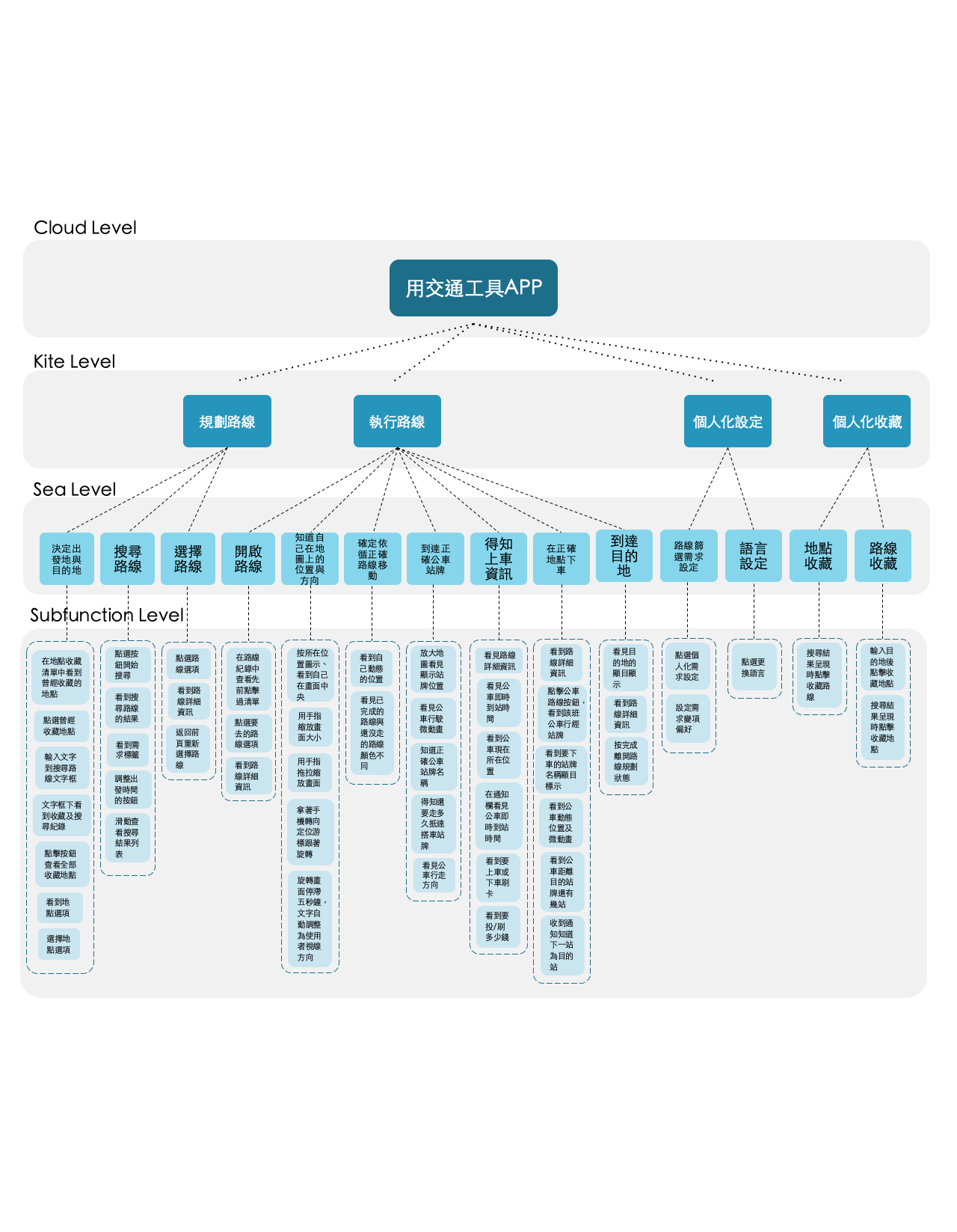
Information Architecture and UI Components
Based on our research and task analysis, the information enivironment of our app consists of two part, one is the users' personalized information such as personal setting, saved routes, and saved places, while the other part is planning and demonstration of the directions. For personalized information, we structure it with the hub-and-spoke pattern, and for the planning and directions, we organize the information with the nested list pattern.
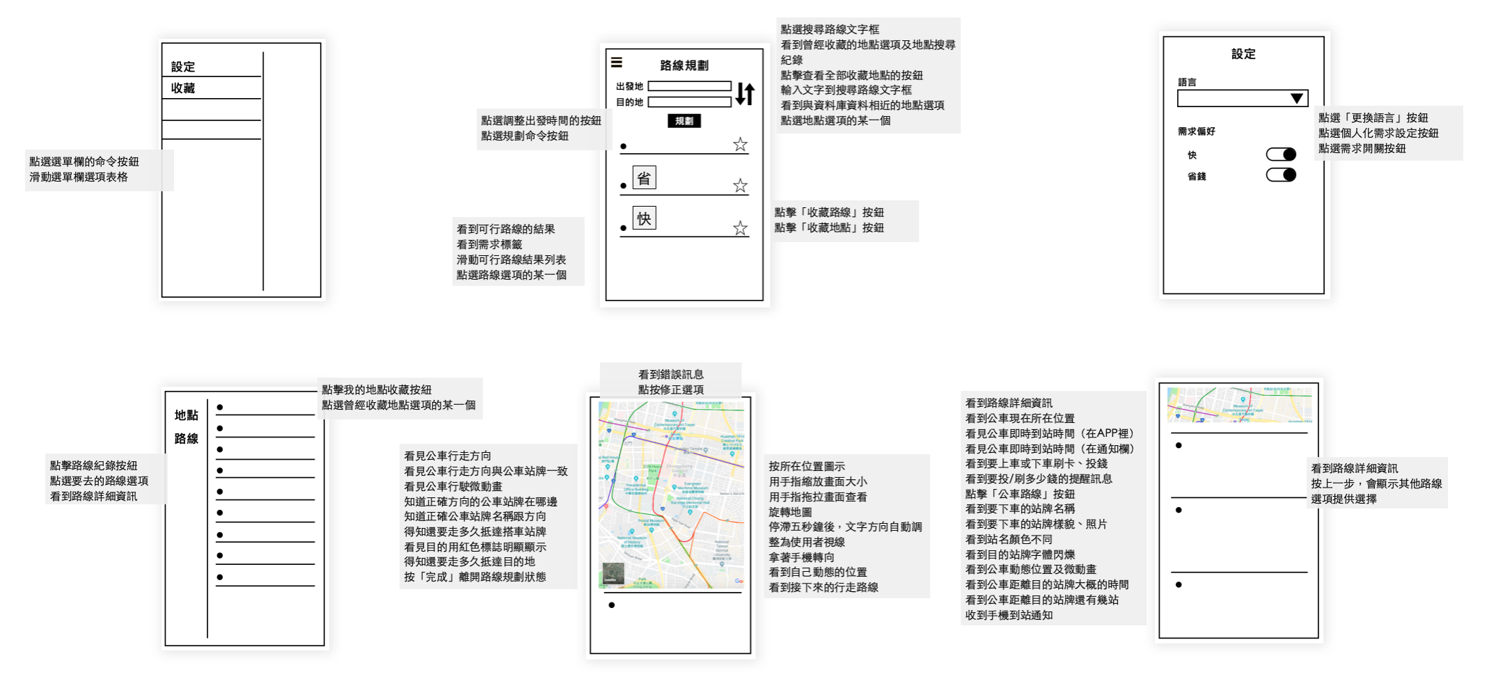
After performing task analysis to form the use cases into interfaces and analyzing the information architecture of our app, we then transformed the use cases and information into UI components.
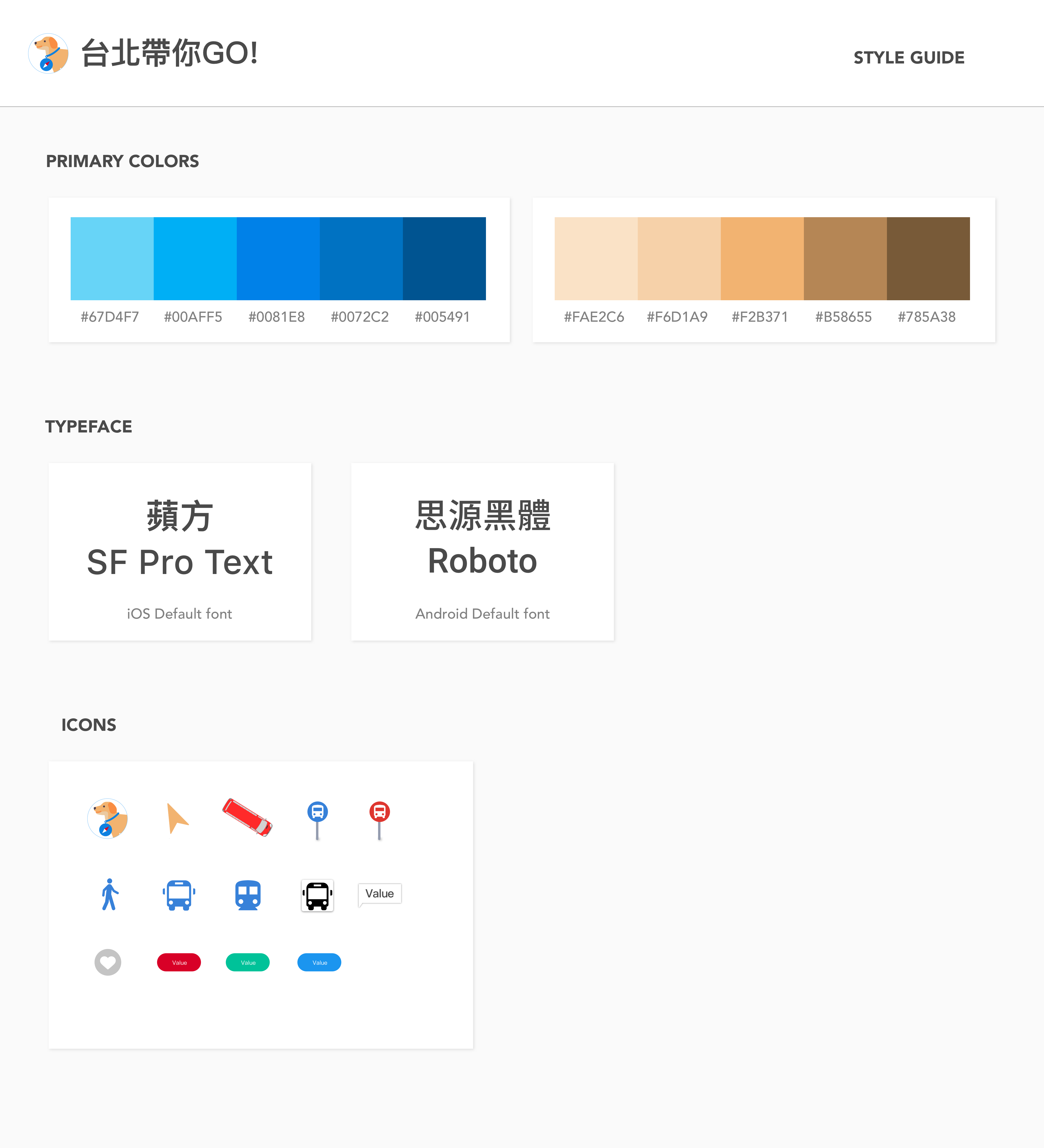
Brand Identity and Visual Style
Before starting the visual design, we defined our brand identity with adjectives describing the features or characteristics of our product such as reliable, considerate, familiar, personalized, and so on.
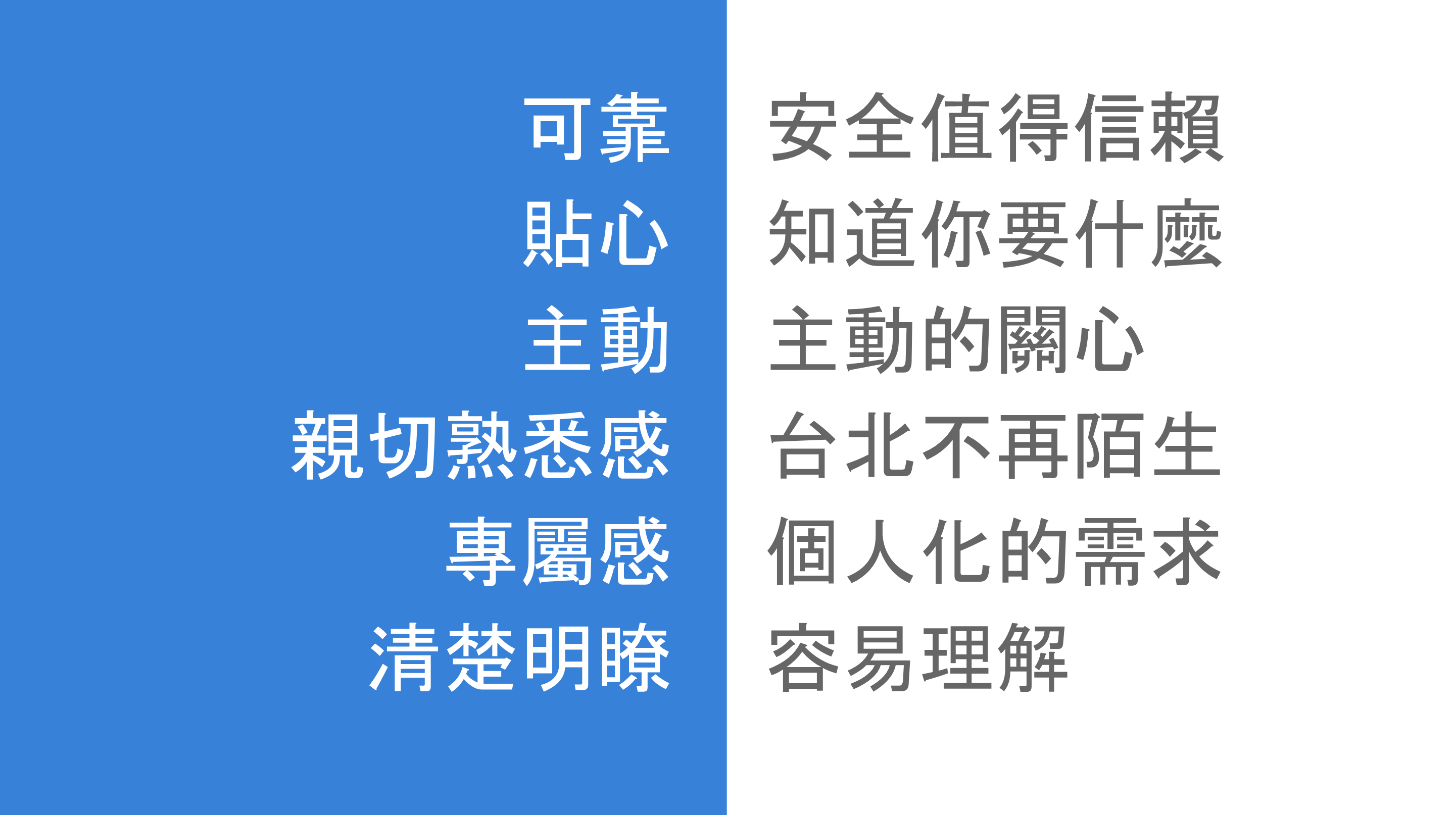
We then defined the visual style guide for our app according to the characteristics we had defined earlier.
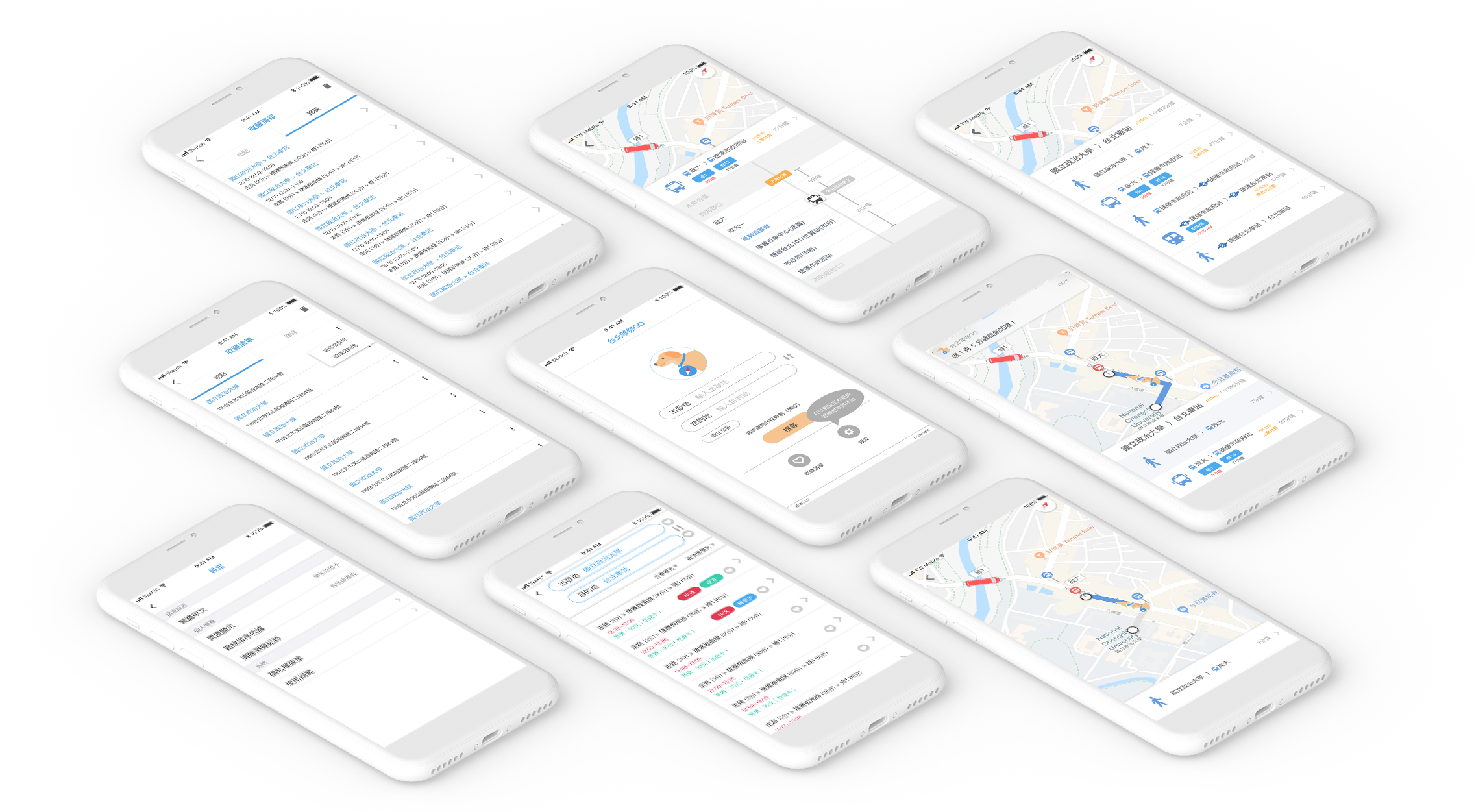
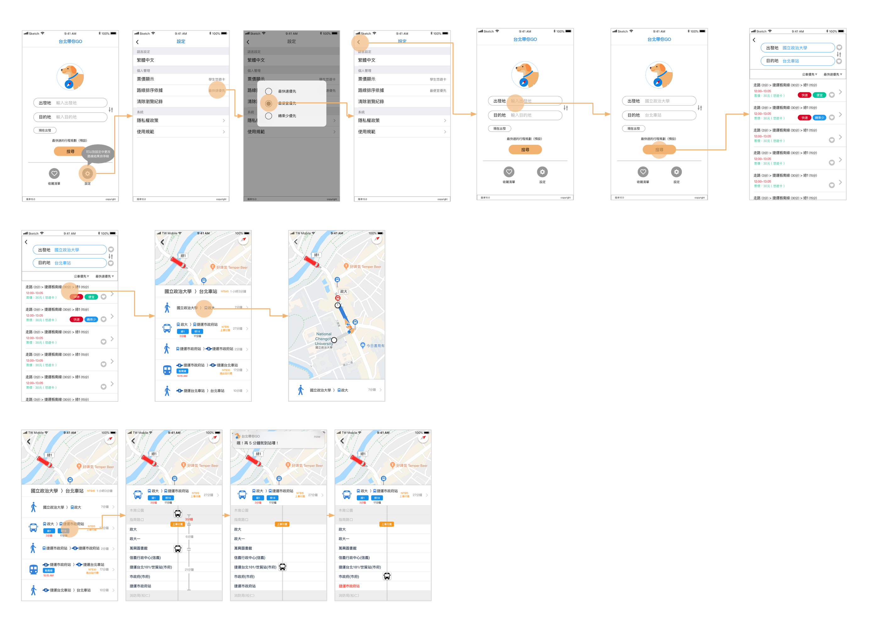
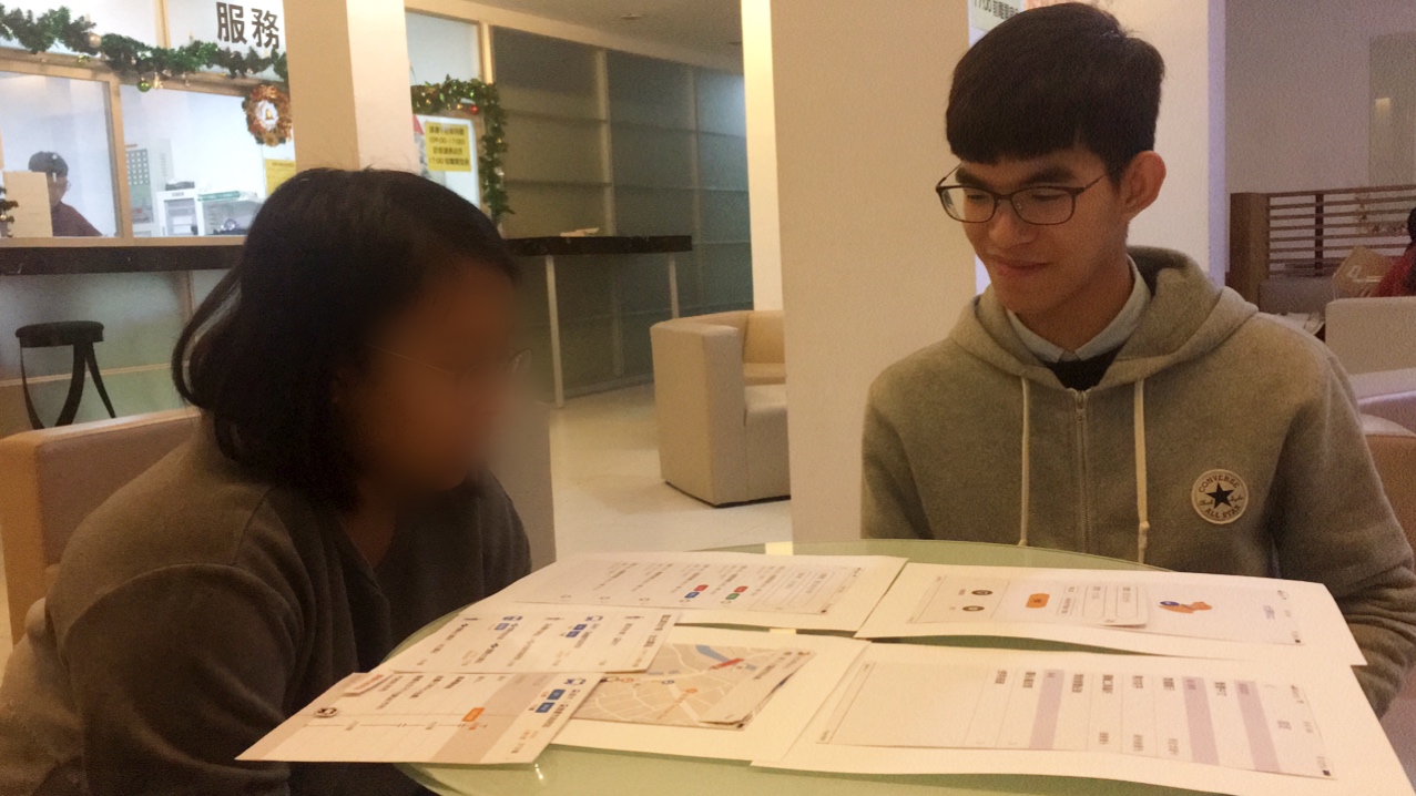
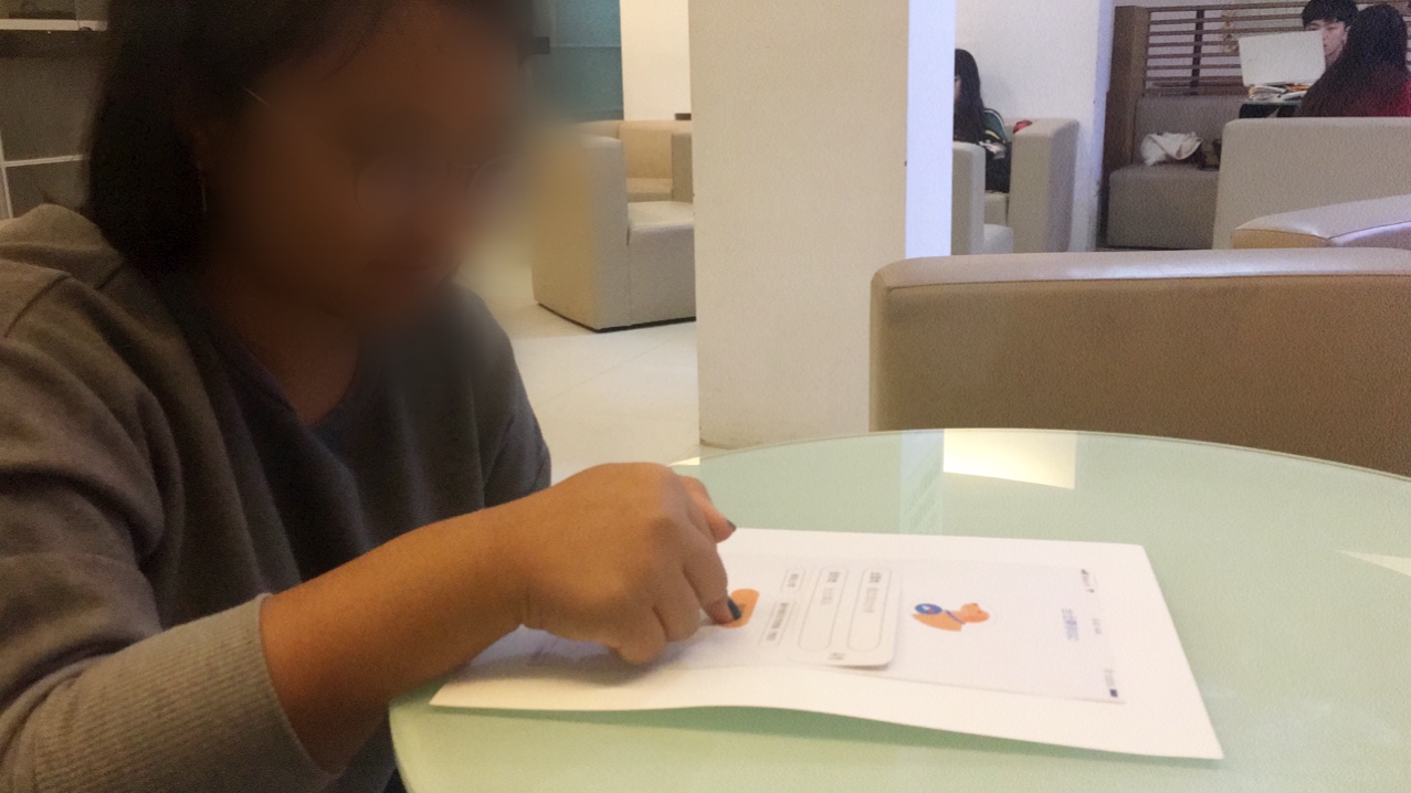
Prototyping and Testing
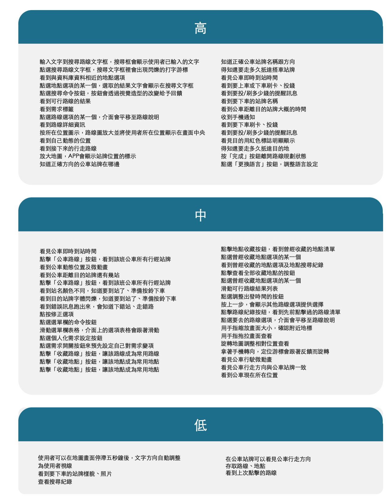
We tested the three most important use cases with our users, which are setting their preferences for sorting results and selecting a direction plan, following the directions on the map to the bus stop, and getting off at the right stop.
Evaluation
Our users found that most of the actions were easy to perform and were able to solve their pain points. However, they were quite confused with the word "need", and they also wanted to change their preference for sorting on the planning result page.
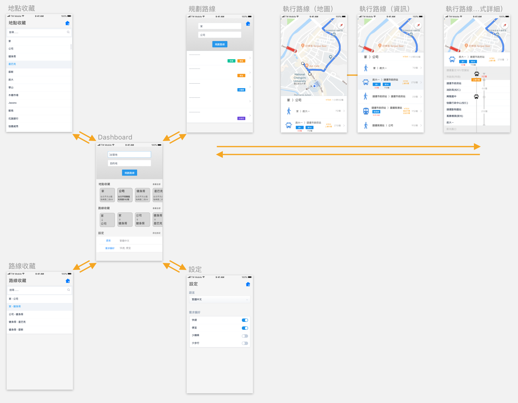
Final Design